stay home photo tip #5: using color
May 20, 2020
Ever find yourself drawn to certain colors, or color combos? Have you ever wondered why?
Color is an important element to consider when taking photos, and using color effectively can take your photos to the next level.
I could dive deep into color theory, and talk about it for days on end, but that would probably bore you. So let’s focus on gaining a basic understanding of color relationships as they relate to photography, and how to use color to enhance your photos.
Are you ready? OK!
Think back to grade school art class. Remember the color wheel? Allow me to refresh your memory:
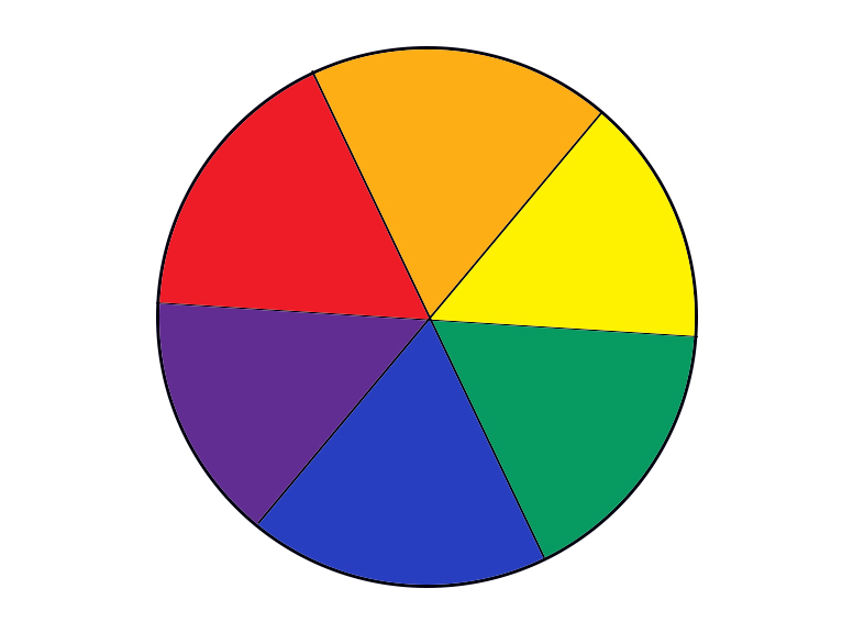
This is your best tool when it comes to thinking about color. It tells you everything you need to know about color relationships in a simple diagram.
Let’s start with complementary colors. Complementary colors are directly opposite each other on the color wheel. Pairs of complementary colors include:
- Red & Green
- Blue & Orange
- Yellow & Violet
These color relationships work well together for a reason. Let’s play a game to help understand what makes these pairs of colors “opposites”.
Here is a red square. Stare at it for 30 seconds, without breaking your focus. When you’re done, close your eyes and open them, then look immediately at a white wall.

What do you see?
You see a green square. That’s because complementary colors are opposites for a reason. They are the absence of the opposite color.
We could repeat the same experiment with a blue square, a yellow square, or any other color, and the result would be that you’d see its complement.
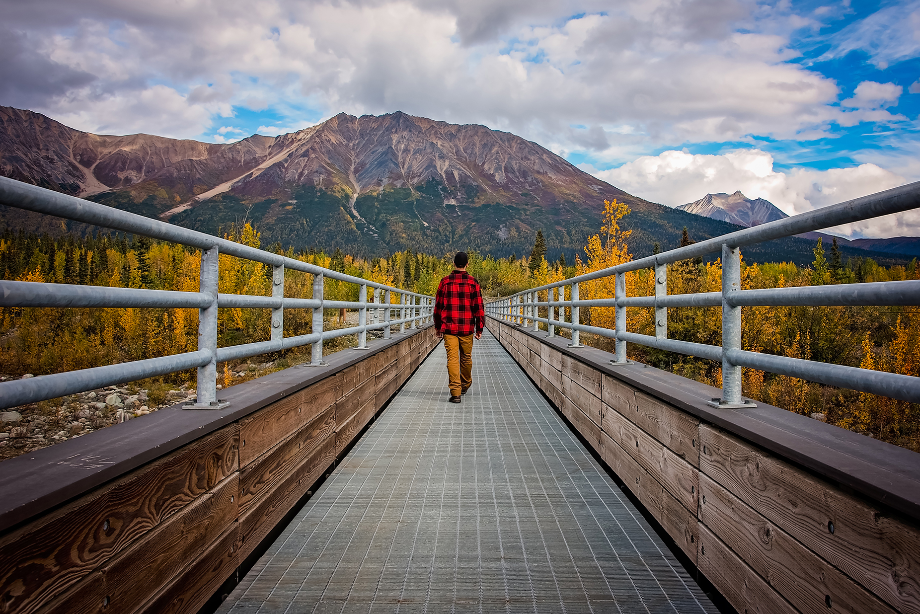
Complementary colors work great together in photographs because they add balance to your image. Here are a few examples of complementary color pairings at work:


The next set of color relationships I want to discuss are triads. Your two main color triads are:
- Primary colors: Red-Yellow-Blue
- Secondary colors: Green-Orange-Violet
Using complementary colors or triads in your work will make your images more visually pleasing to the viewer, without them even knowing why—it’s ingrained in our brains! Paying attention to color relationships creates harmony in your images—and that will in turn give your photos greater impact.
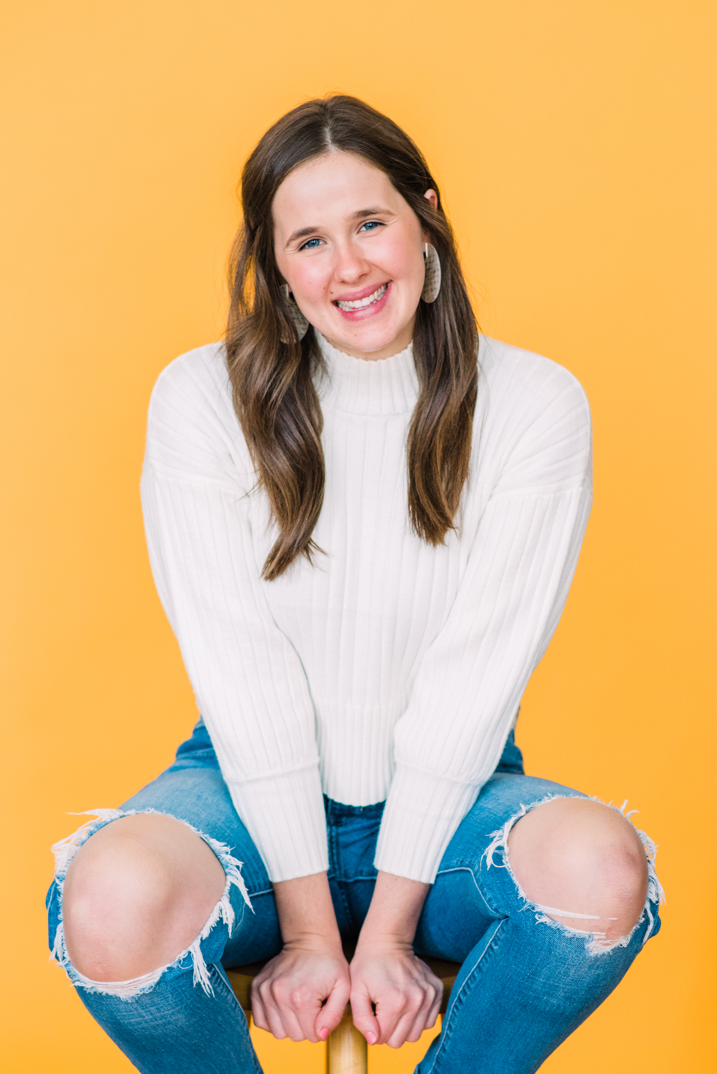
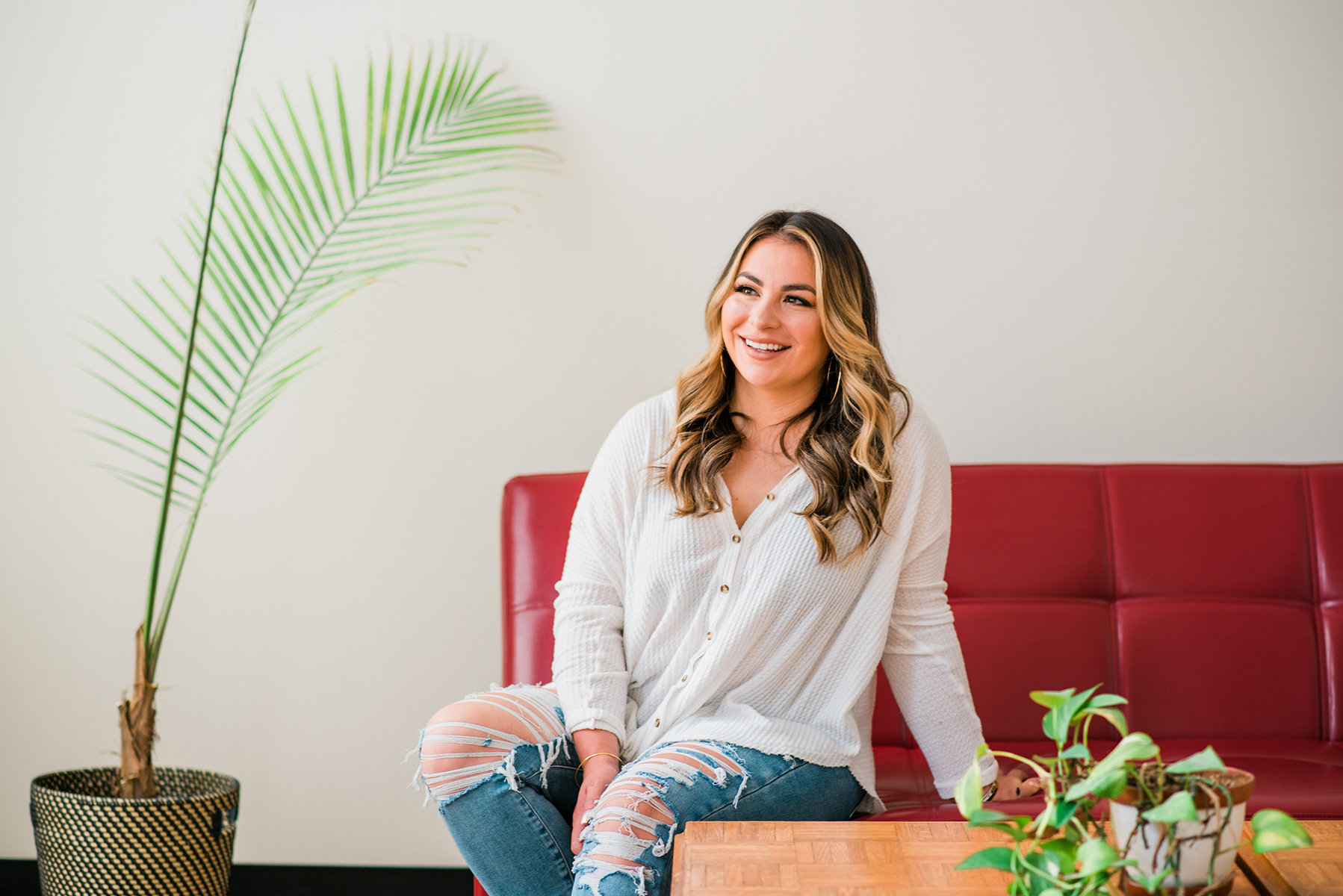
Here are some very different examples of images using the same primary color palette:
Play around with creating photos that use color pairings in different ways to see which relationships you are drawn to. Understanding and using these natural color relationships in your images will take your photos to the next level and help you to create beautiful images that resonate strongly with your viewer.
Using color deliberately doesn’t have to mean sticking to color relationships either. One of my favorite ways to use color is by creating monochromatic compositions. What does that mean? It means creating images that rely on one color. Have a look at the images below. Do you see what a strong image can be made by using color deliberately like this?


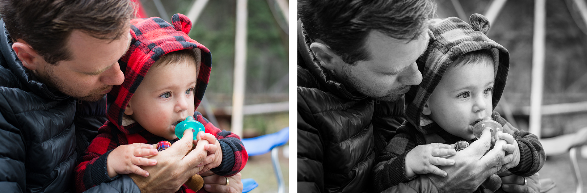
Like anything else, you don’t *always* have control over the colors in your photos. Sometimes you’re shooting candidly, and everyone’s outfits clash, or there’s some big, bright, colorful thing you find distracting. That’s when converting to black and white can come in handy.
Black and white images are inherently monochromatic, and making an image black and white is a great way to remove distractions caused by color. Take this example. I thought this image of my husband with my son was sweet, but was really bothered by the bright green pacifier and the bright blue camping chair behind them. Converting the image to black and white took these distractions away, and gave me a much more beautiful image that focused on the moment between my subjects instead of bright, colorful background objects.
Like I said…I could talk about color alllll day—but the important takeaway from this is to think about how you use color in your photos, and to use it intentionally to compose stronger, more impactful photos. Practice using color deliberately, and you’ll start to notice what a difference it can make in your work.
Check out my other #stayhomephototips posts here on the blog, and stay tuned for more! If you’d like them delivered straight to your inbox, sign up for my email list here! 👇🏼